Lessons from 12+ Years in Identity Design
Over the past twelve years working in identity design, I’ve been lucky enough to help brands of all sizes find their voice and visual expression. From scrappy startups to established institutions, I’ve seen firsthand how brands evolve—and how some manage to stay relevant, recognizable, and respected over decades. So what’s their secret?
While styles shift, platforms change, and technology constantly redefines how we interact with visuals, certain principles of brand identity hold steady. Timeless brands aren’t just born from clever logos or on-trend palettes. They’re built from intention, clarity, and consistency. In this post, I want to share the elements I believe make a brand timeless—drawn from over a decade of hands-on experience in identity design.
Start with Substance, Not Just Style
A timeless brand starts with a strong foundation: its values, mission, and personality. These are the things that don’t change, even when the logo or tagline gets refreshed. When I begin any identity project, I spend time getting clear on these core ideas before I ever open a design program. What does the brand stand for? What does it promise its audience? What tone does it want to strike?
Without this grounding, even the most beautiful design can feel hollow or inconsistent. But when there’s real substance behind the visuals, the brand resonates across time and channels.
Take a client I worked with early in my career—an education nonprofit focused on equity. Their initial materials were dated and cluttered, but their mission was rock-solid. Once we clarified their voice and visual values (warm, trustworthy, and empowering), the design practically shaped itself. Even years later, their visual identity still feels strong—because it reflects who they truly are.
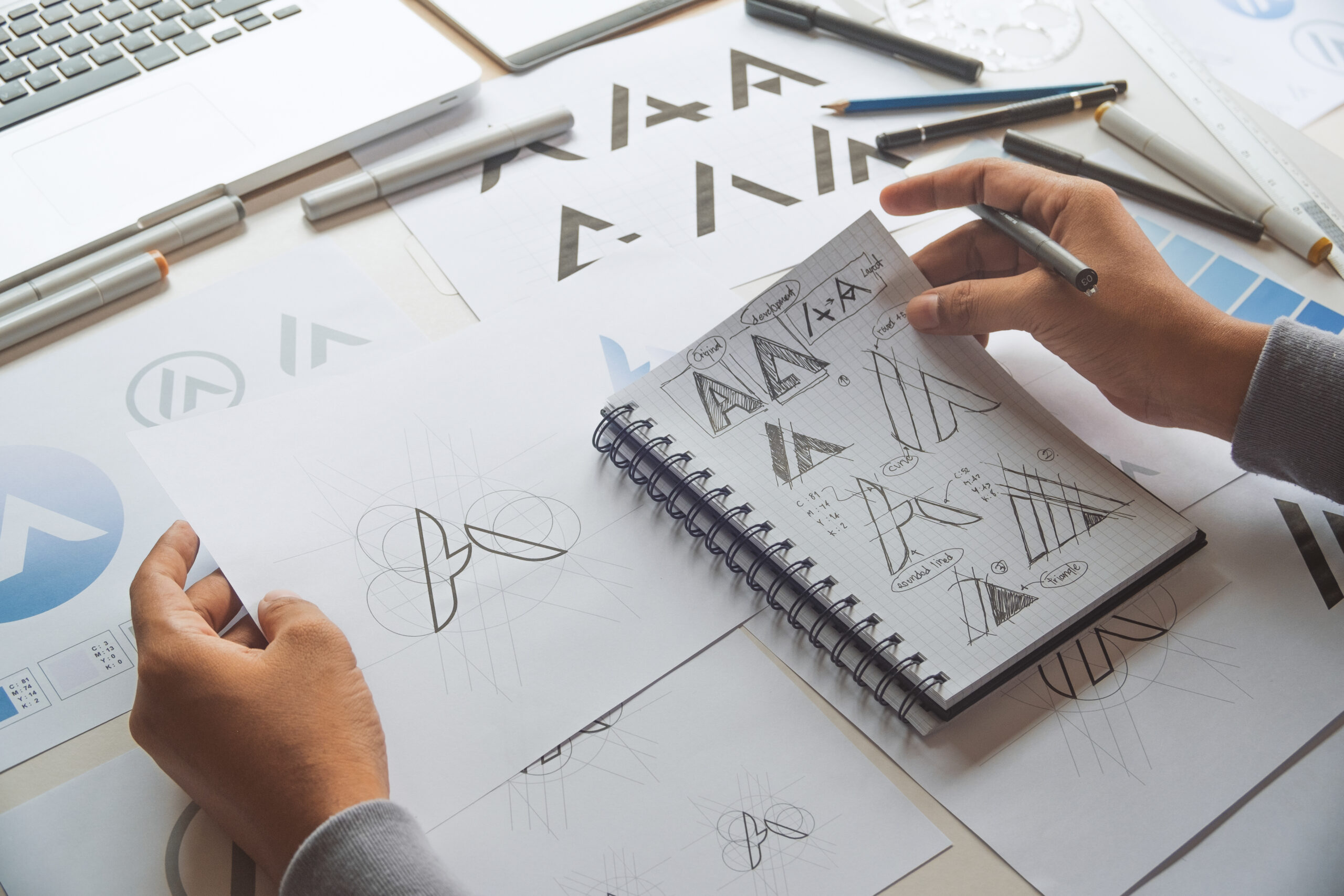
Simplicity Is a Strategic Choice
If there’s one design principle that never goes out of style, it’s simplicity. Timeless brands embrace restraint. They don’t rely on gimmicks or visual overload. Instead, they create space for the core message to shine.
Think of the most iconic logos—Apple, Nike, National Geographic. Each one is simple enough to be remembered, reproduced, and recognized at a glance. That simplicity doesn’t mean blandness; it means clarity and confidence.
When designing a brand identity, I often push clients to pare back rather than pile on. A clean logo, a strong type hierarchy, and a refined color palette often outperform more complex systems. It’s not about being boring—it’s about being durable and adaptable.
Consistency Builds Trust
One of the easiest ways for a brand to lose its impact is inconsistency. Over the years, I’ve seen many promising identities diluted by scattered execution. A different logo here, a rogue font there—suddenly, the brand doesn’t feel like one thing anymore.
Timeless brands have a clear system and stick to it. That doesn’t mean every piece of collateral needs to look identical, but there should be a unifying thread—through color, type, tone, or layout—that tells the viewer, “This is still us.”
That’s why I don’t just deliver logos—I build identity systems. I include brand guidelines, usage examples, and flexible tools that allow the brand to grow while staying rooted. When teams understand how to apply the identity, they become stewards of it, and that collective consistency compounds over time.
Adaptability Is Key to Longevity
While consistency is crucial, rigidity can be a problem. Timeless brands are consistent, yes—but they’re also adaptable. They can evolve without losing their essence.
This might mean introducing new colors or secondary typefaces, refreshing imagery, or redesigning packaging for a changing audience. The key is to evolve with intention—not to chase trends, but to reflect growth and context.
One client, a boutique skincare line I worked with, came to me for a refresh after ten years in business. We kept their original mark (slightly refined) and introduced a more modern color palette and typography. The result felt fresh but still familiar. That’s the sweet spot.
Emotion Over Ego
Timeless brands don’t just look good—they feel right. They connect with people on a human level. And that connection isn’t driven by the designer’s ego—it’s rooted in empathy for the audience.
When I design, I’m not trying to make something that wins awards or goes viral. I’m trying to make something that resonates, that supports the brand’s story and the people it serves. Timeless identity design is ultimately not about the designer; it’s about creating something that lives, breathes, and belongs to the brand and its audience.
Typography and Color That Endure
Some visual choices simply age better than others. I’ve found that timeless brands tend to use typography that’s legible, versatile, and thoughtfully selected—not just what’s trendy. Classic typefaces like Garamond, Futura, or Helvetica (used well) still hold power because they balance personality with function.
The same goes for color. Timeless palettes often lean on a few key shades, with room for expansion. They’re rooted in meaning, not just aesthetic trends. A color that feels authentic to a brand’s voice will always wear better than one chosen to chase a fad.
Time as a Design Partner
Over the past 12+ years, one of the biggest lessons I’ve learned is that time itself is a design partner. It reveals what works, what sticks, and what fades. When designing identities, I try to think in terms of years, not weeks. How will this look when the website is redesigned? When it’s embroidered on a shirt? When it’s seen by someone five years from now?
Timeless design isn’t about resisting change—it’s about anchoring your brand in meaning, clarity, and intention so that it can grow with integrity. And when that foundation is in place, your brand won’t just look good now—it’ll stay strong for years to come.